Overview:

This is a team spec project.

The vision for this project was to build a new feature to the app OpenTable that would give users new ways to connect and get recommendations. The extra user engagement would lead to more reservations being placed and ultimately more sales of OpenTable’s software to restaurants as adoption and usage continue to grow.

My Role:

UX designer with a focus on research and prototyping. I had a hand in every part of the process but tackled the entire prototyping stage on my own.


Timeframe:

2 week sprint

Applied Skills:

Competitive Analysis | User Interviews
Affinity Mapping | User Personas
User Flows | Wireframing
Prototyping | Usability Tests


Programs:

Figma | Miro | Adobe Illustrator | G Suite

Frame 4.png

Company:

OpenTable is a tech company that sells software to restaurants to help them manage reservations as well as connecting them directly to the customers placing them.


OpenTable wants to increase user engagement and reservations.

With over 60,000 restaurants around the globe bookable through OpenTable as well as 1.6 billion diners serviced each year, OpenTable has a commanding hold on the restaurant reservation market. In an effort to increase engagement and reservations, OpenTable is looking to add a feature to their app. The biggest concern for OpenTable is that the app feature DOES NOT compromise or complicate the existing reservation process.

Frame 4.png

First we need to check out the competition.

Our team started with competitive analysis to see what features OpenTable may be missing that other apps have. OpenTable has a lot of features, so it was difficult to pinpoint where the app may be lacking. We compared OpenTable with Resy, Yelp, Seated, and Tock. The most notable missing features were the following:

  • Social Functions

  • Photostreams

  • Friends and friends lists

  • Shareable favorites lists

Could OpenTable use a social media function?

With the short timeframe for the sprint, we wanted to go into our first interview with an idea of what to add. This analysis combined with a thorough feature inventory of OpenTable lead us to hypothesize that the app could use a social media function. Theoretically, this increased social engagement between the users on the app would lead to more reservations being placed as people could more easily recommend places to each other. The other critical component of this social function was a stream of photos from restaurants and users. The hope was that users would see delicious looking food, tap on the post, and then be brought to the restaurant page and make a reservation. The perfect idea right?

Frame 4.png

Turns out we were wrong! Time to pivot.

Wrong! After conducting ten interviews with people who use OpenTable, we took their statements and quotes and categorized them into “I statements.” We managed to confirm that people are influenced heavily by social media and food posts. However, our users were quite adamant that they don’t want OpenTable to be another social media. They go there simply to place a reservation and that’s about it. 

The data did reveal some amazing new insights though that we had not considered. The biggest pain point in using OpenTable actually comes before using the app. People expressed a lot of frustration in the researching process for choosing where to eat. Users solve this problem by getting recommendations from friends and using map-based applications to quickly scan their surrounding area for highly rated places to eat. Suddenly we had a moment of inspiration and realized that that is where we can gain new users. 

Please click to view larger.

Users’ biggest pain point is in finding a restaurant, not placing a reservation.

Our shiny new concept become the following:

The saved tab will be expanded. Core to this new feature is the ability to share the saved list with friends. The user and their friends are able to filter and sort shared lists or their own list. Lastly, and the coolest part, the user can project their saved list onto a map and filter the map view to also show any combination of theirs and friends’ lists. The goal of this feature is to help users find new places to eat by being able to easily scan their friends’ lists as well as their own. With further user engagement and easier access to trusted recommendations, users should place more reservations; ultimately solving the original business goal from OpenTable. 

Frame 4.png

Meet Owen Taylor!

With our goal set and research supported, we moved on. Now that we have a good understanding of who our user is, we compiled our “I statements” from our affinity map into a user persona. From this point on, we will use Owen Taylor to make sure that our decisions are in line with our target audience.

We used a group design workshop to pinpoint features and ideas we wanted to use in the app.

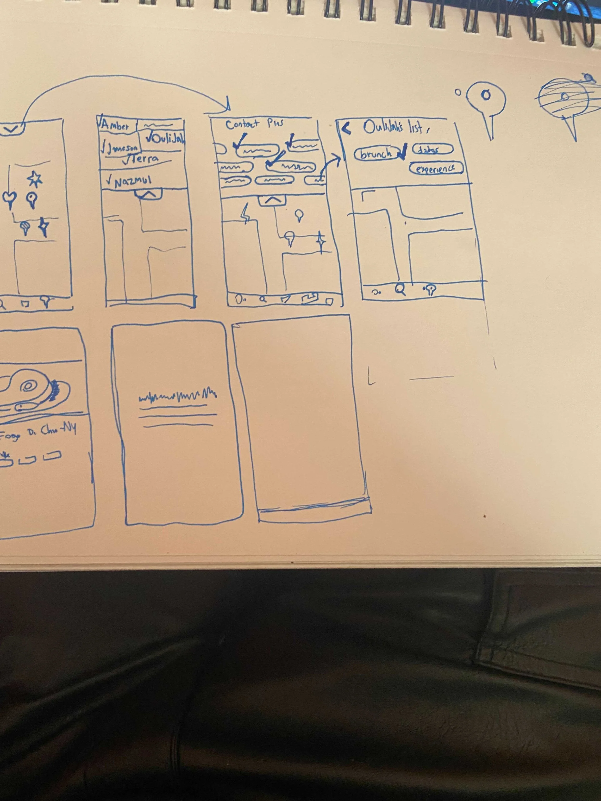
Once the idea was settled on, we had a million ideas for features and layouts. Ultimately, we decided to sketch wireframes separately for 20 minutes and then reconvene. We all presented to each other and then, as a group, we decided which features we wanted to keep and remove. 

I thought that it would be best to allow the user to make lists within their saved tab. That way, the user is able to send a certain list of recommendations to a friend without sending everything. We decided that it would be more elegant and less work for the users if they did share everything, but they were able to filter down the lists. That way, instead of needing to separate Mexican restaurants into a list to share Mexican recommendations, the friend could just filter by Mexican cuisine. This also gave them more control over what they are seeing and allow them to filter by other categories such as location, rating, etc.

Design Workshop

Final Sketches

Frame 4.png

Special care was taken to stick to OpenTable’s design system with the prototype.

At this point we were ready to dive into the prototype and I took over. I went through all of the existing app’s relevant features and took screenshots. Then I used their brand information and existing visual styles within the app to develop a set of guidelines for our addition to the app. It was very important that we kept the designs consistent with what users had come to expect. Below is a graphic of all the ways that I used the existing app to inspire the layout and visual style of our addition.

Staying organized and using best practices with Figma for the high fidelity prototype.

Sorry if this section is long filled with too much jargon, but I just love figma and prototyping! 

I approached the whole prototyping process with atomic design in mind. I started by taking the brand’s colors and creating squares of color that I then combined with layer masks to create all the various components I was going to use. Those components were comprised of various levels of depth. The first layer was icons and small graphics; I drew or created every icon in the app within figma using the pen and shape tools. Then the next layer was comprised of those icons and boxes to make things like buttons and menus. Lastly, those buttons and menus were combined with each other to make the biggest components such as the headers, footers, and restaurant sliders. Almost every component also had variants that made it easy to change things on the fly. I designed it this way so that small changes to the initial components would be reflected throughout the app. This allowed us to redesign things with minimal effort as we get feedback. Since it was a group project, the atomic design also made it easier for groupmates to follow along as they looked over the designs.

Lastly, I created a few animations that helped make the prototype feel more real. The one I’m most proud of was the map loading animation which involved loading a page with a wide, zoomed out map. The map would then scale up to emulate zooming in. The image of the map was then replaced with an unscaled screenshot of the area that kept everything at the same aspect ratio, but made all the text smaller than the zoomed in version of the map. Lastly, the corresponding map icons would load in depending on what filters you activated. 

The map feature is fully clickable and robust. It is capable of applying a Mexican food filter, multiple friend filters, or no filters, which just makes it project your list on the map. It is fully navigable between a list view and a map view. It preserves which filters you have active and displays each page accordingly. 

Enough description! Here is a video of the app in action with the corresponding tasks to the side:

Frame 4.png

Users understood the feature, but a few graphics tripped them up.

We ran two rounds of usability tests with our high fidelity prototype. All of our users were able to complete the tasks, but some of the icons and symbols were confusing. I outline the problems and solutions below:

Next steps and final thoughts.

For the next steps, we got some awesome feedback during the usability tests that I would want to implement.

One user suggested being able to attach notes to the restaurants that they share. That way they could specify a particular meal they had that they want to recommend.

Another good idea we got through usability tests was further integration of the feature to the rest of the app. Now that users are able to connect and recommend things, that could be reflected all throughout the map. In particular, the browsing section of the homepage could have a symbol to show that a restaurant there has already been recommended to you.

Lastly, this feature is new and interesting. My next step would be running more usability tests and user interviews to determine what the users would like to see added or removed from the feature.

Overall, this project served as an excellent exercise in figma, prototyping, research, and teamwork. I feel very confident in all four of those now and am excited to see what comes next!

Frame 4.png

My other projects: